The Pain of Lovers
EXCERPTS of a Film Review by Wen Jin Shi of “NEW CINEMA” - TRANSLATED from the original Chinese published on 11.10.2021
As a new director Neysan Sobhani made some bold choices. Setting the story in the near future is not usually a first option for a small budget film. Nonetheless, the simple yet futuristic special effects, coupled with a lush green country setting, achieved an aesthetic balance.
……..
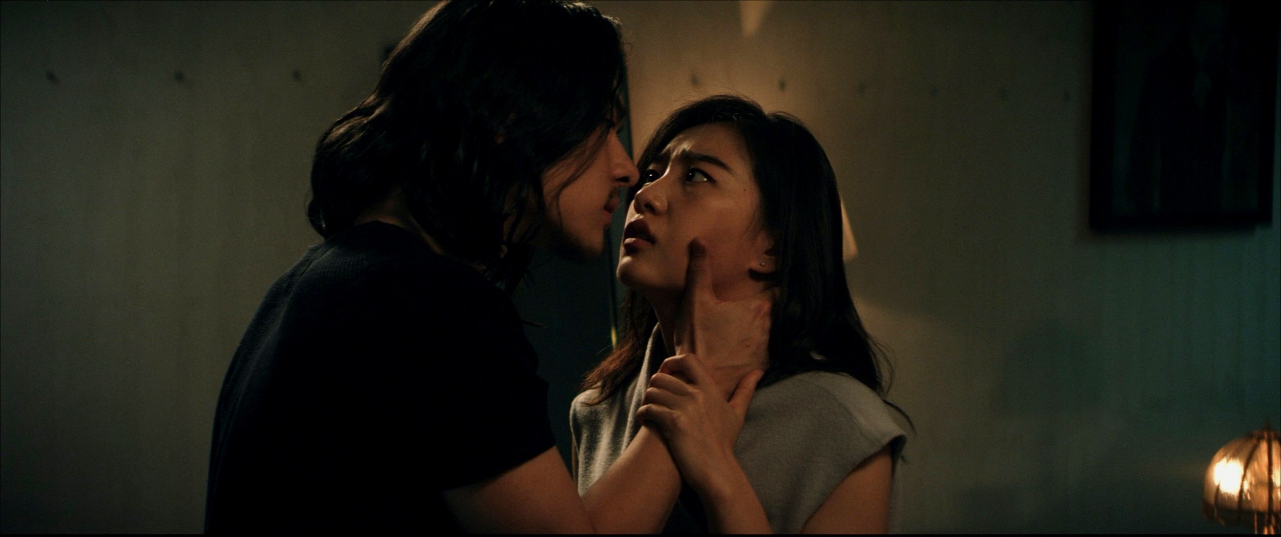
A distinctive part of the film is its use of two aspect ratios: 2.35: 1 and 4:3. The selection of different frames in GUIDANCE greatly affects the composition of the film, leading to a variety of subtle visual effects and with many scenes containing subconscious clues.
……..
Let's start with the 2.35: 1 scale, which is a common movie ratio. In this frame. In GUIDANCE, this frame is used primarily, although not solely, for flashbacks.
……..
In the 2.35:1 wide frame, the heroine and her ex-boyfriend seem distant, even in a confined space. This physical distance undoubtedly symbolizes emotional distance as well. At the same time, the nightmare of the heroine drowning also appears alternately in 4:3 ratio. The whole screen is filled with a despair of an end that may inevitably come, generating a special tension.
……..
There’s another bold choice in the Director’s decisions: The characters in the film have obvious shortcomings, and making this choice, especially for the lead actress in this scenario, is risky. The audience's judgment of the characters will ultimately affect the judgment on the film. Even so, the director deliberately chose this approach. This is the kind of refreshing insistence that comes from smaller independent films like GUIDANCE.
……..
As the main two characters in the story stay in the small white villa they are trapped in the square 4:3 lens—so close in a confined space that they and we feel the urge to escape. Can a person breathe normally when the distance between two people is infinitely closer and there is no room for any lie?
